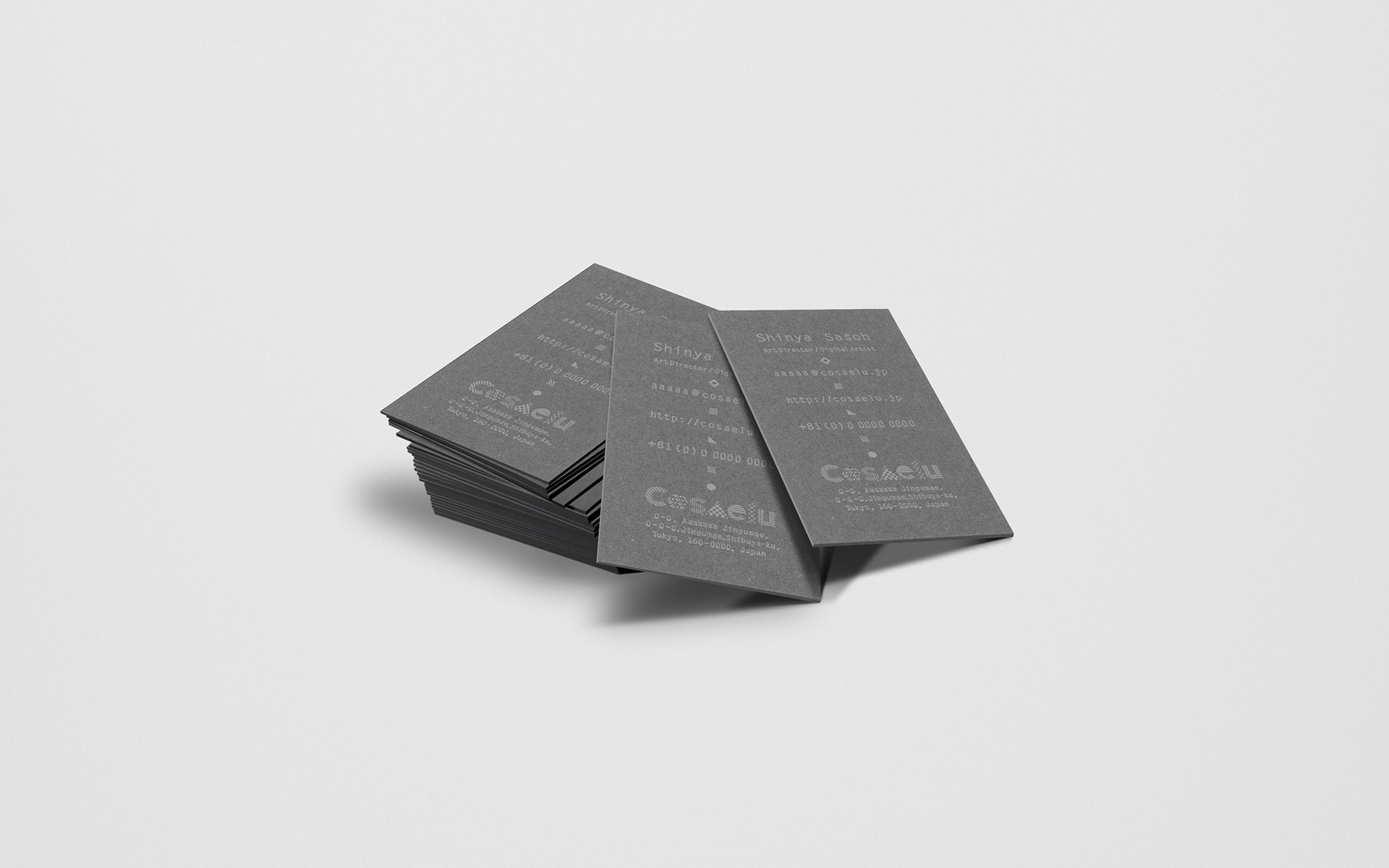
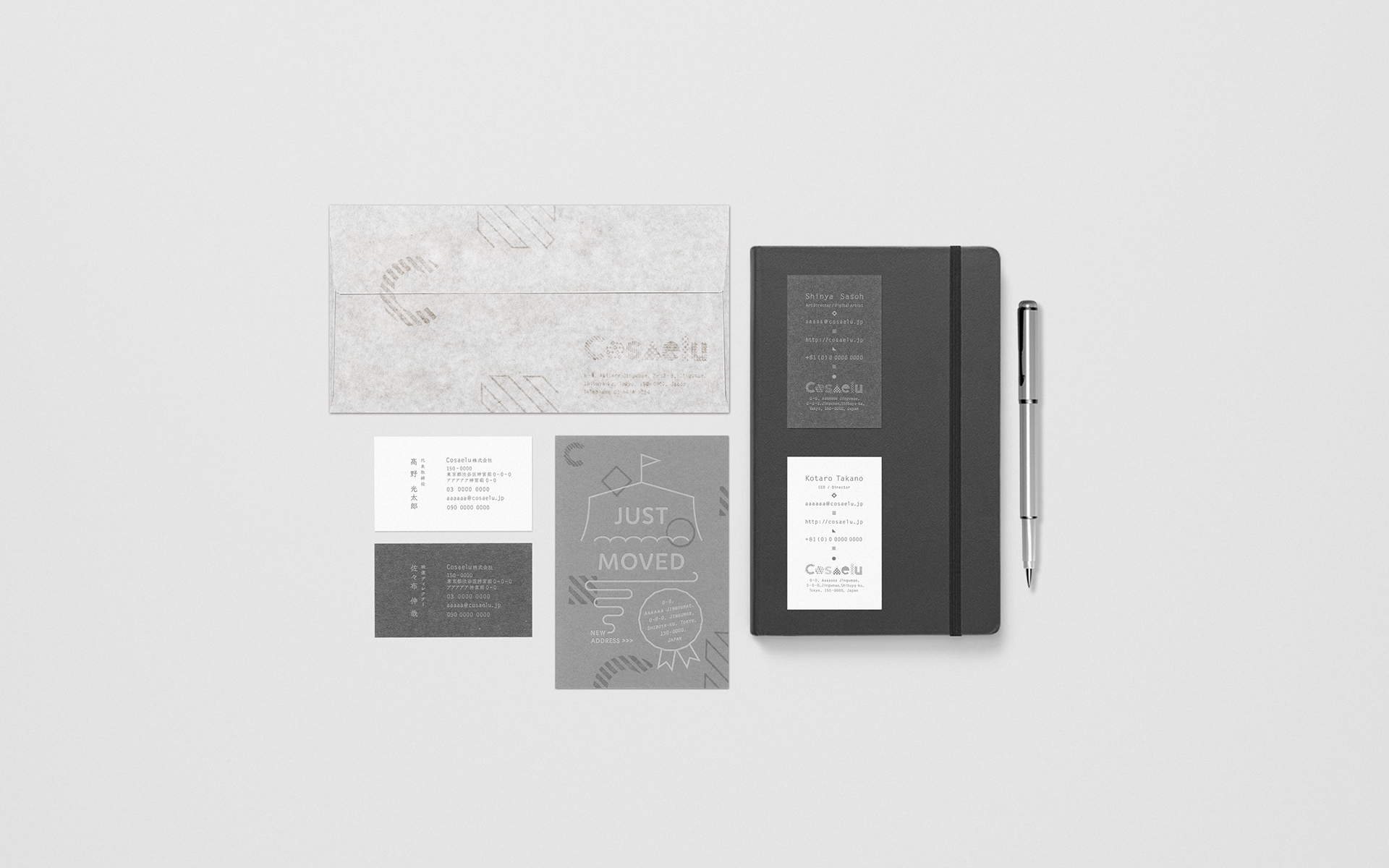
ロゴ・名刺・カード・封筒デザイン/名刺A:4号(91×55mm)・GAファイル・グレー・310kg・活版印刷・墨/名刺B:4号(91×55mm)モデラトーンGA・スノー・200kg・オフセット印刷/カード:100mmx148mm・GAボード・グレー・300kg・活版印刷・ライトグレー/封筒:長3カマス・ホワイトクラフト・ハンドスタンプ・バーサマーク My Role:Logo Design, Graphic Design

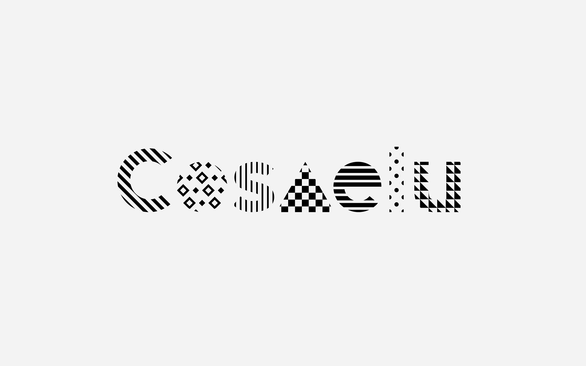
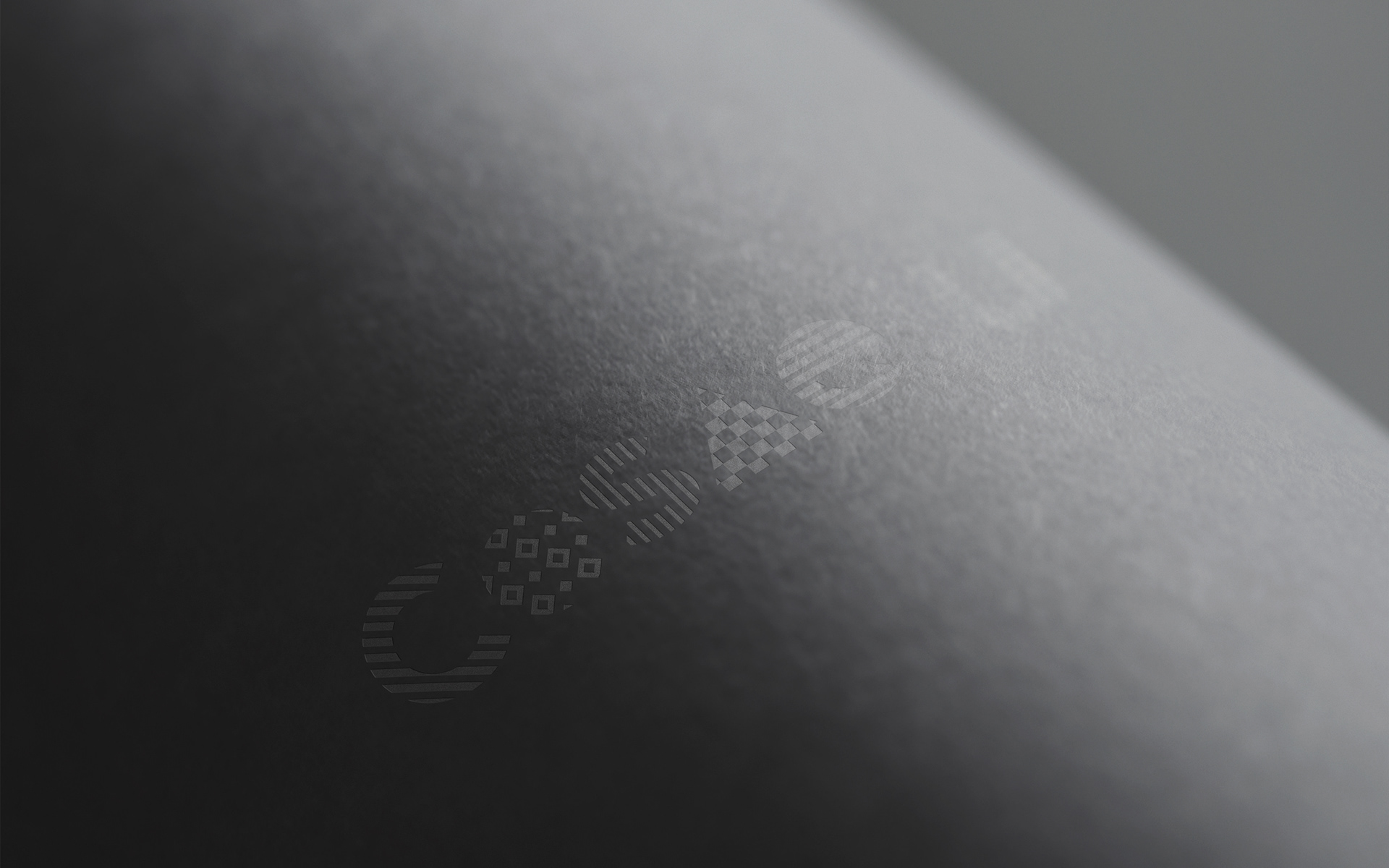
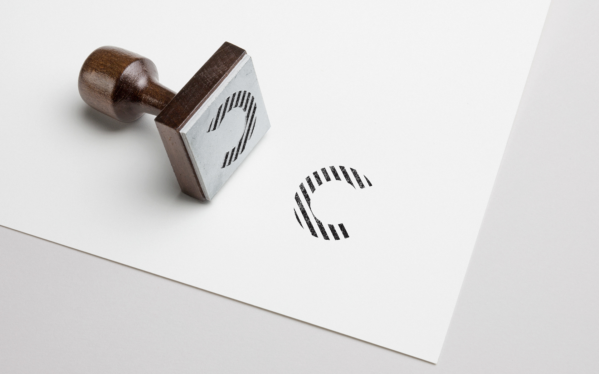
映像制作会社「Cosaelu株式会社」のロゴ、名刺、封筒のデザインを手掛けました。 社名の由来である「こしらえる」の俗語「こさえる」から着想を得て、点在するアイデアやヒントを掛け合わせ、新しい形を組み上げていくプロセスをデザインの核に据えています。ロゴには、組み合わせによって無限の展開を連想させる幾何学模様を採用しました。 ミュージックビデオから劇場映画、プロジェクションマッピングまで、多岐にわたるフィールドで映像を「こさえる」同社の柔軟な創造性と、枠にとらわれない表現の広がりを象徴しています。名刺や封筒などのツールにおいても、この幾何学的なエレメントを基調とすることで、作り手としての遊び心と確かな設計力の両面を視覚化しました。 - I designed the logo, business cards, and envelopes for the video production company Cosaelu Inc. The concept is derived from "kosaeru," a colloquial Japanese term for "koshiraeru" (to make or craft). At the heart of the design is the process of gathering scattered ideas and hints, then weaving them together to construct something entirely new. The logo features a geometric pattern that suggests infinite possibilities through various combinations. This symbolizes the company’s flexible creativity and expansive expression as they "craft" visual stories across diverse fields—from music videos and film to large-scale projection mapping. By applying these geometric elements consistently across business cards and envelopes, the identity visualizes a unique balance of playful craftsmanship and rigorous structural design.