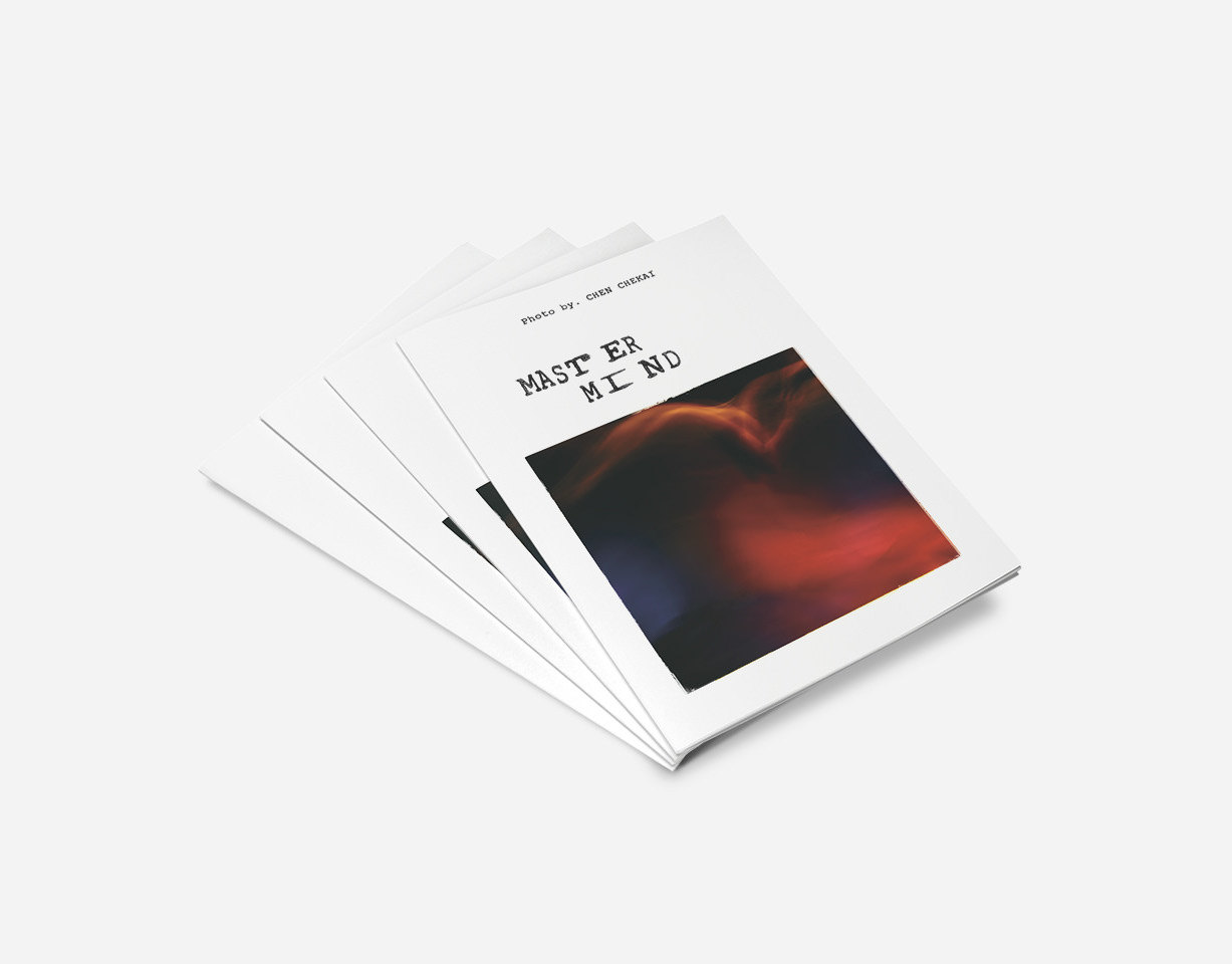
My Role:Graphic Design
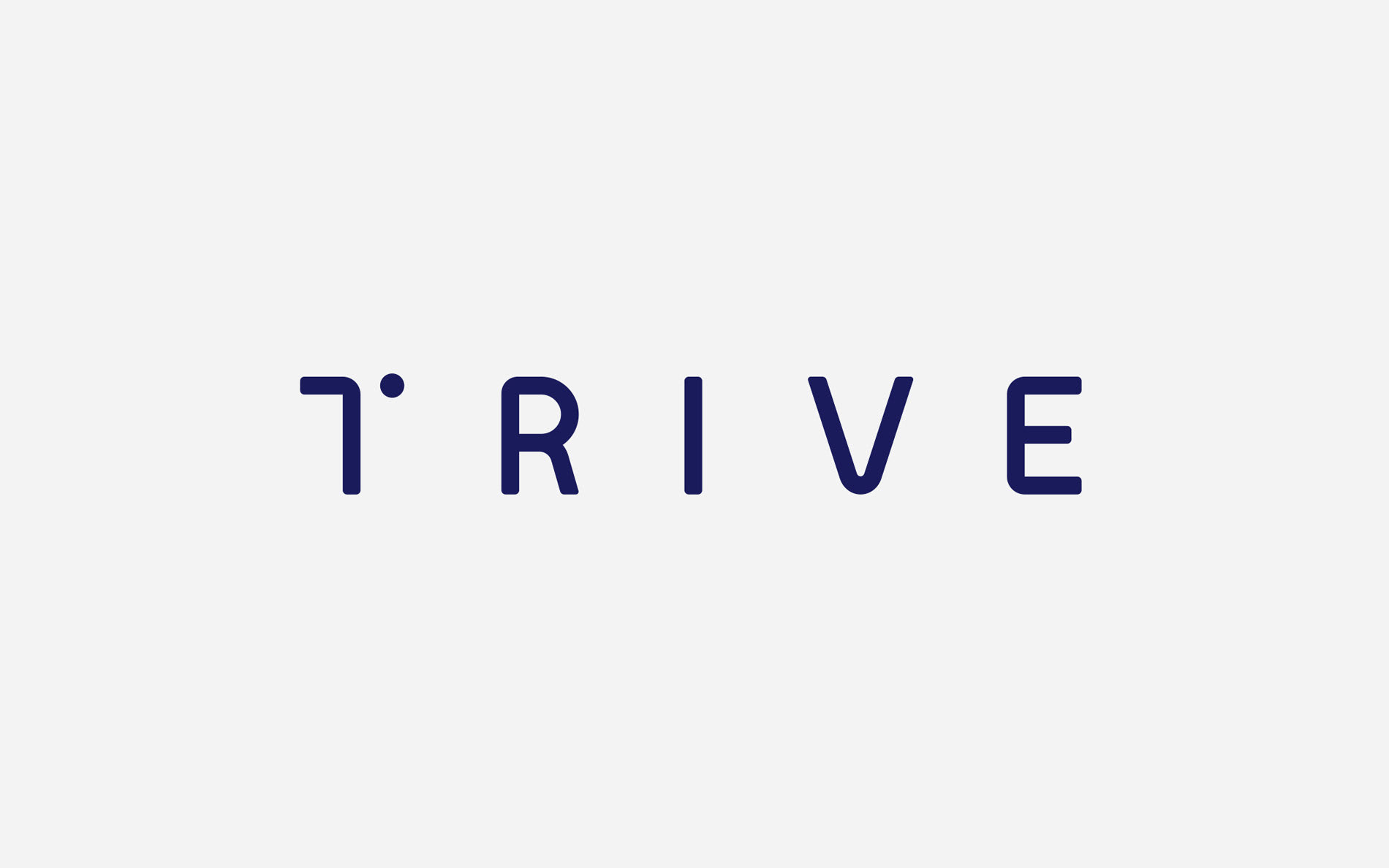
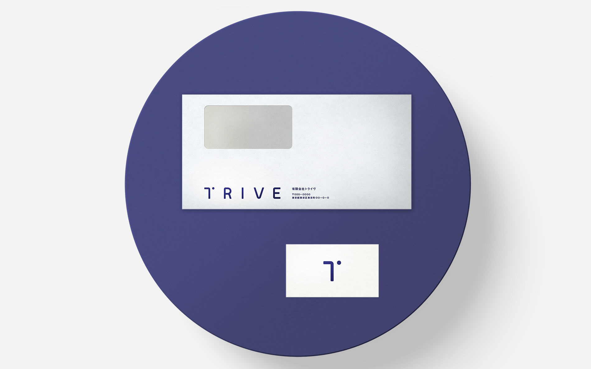
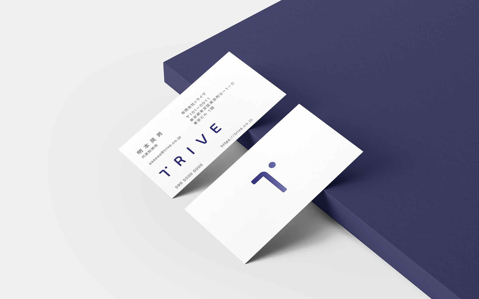
「T」のそばに配置された「点」は、彼らの核となる「視点」を象徴したものです。 映像を通じて、対象をどの角度から捉え、どこに光を当てるか。ウェブのステートメントにある「『素敵』と思うものを作る」という信念は、能動的な視点の移動で具現化されると考えました。一つの解釈に固執せず、多角的な視座から価値を探索し、映像という言語で再定義していくプロセスを、このロゴに映し込んでいます。 10年来のパートナーシップを背景に、彼らが新しいフェーズへ踏み出すための「起点」として構成しました。 - The dot placed beside the "T" represents the "Perspective" that lies at the core of their work. In the world of filmmaking, value is defined by how one captures a subject and where the light is cast. Their shared belief to create things that people find beautiful is realized through this active shifting of perspective. This logo embodies a process of exploring value from multiple angles and redefining it through the language of film, rather than being confined to a single interpretation. Rooted in a decade-long partnership, this identity serves as the "Point of Origin" for the team as they step into a new phase of their journey.