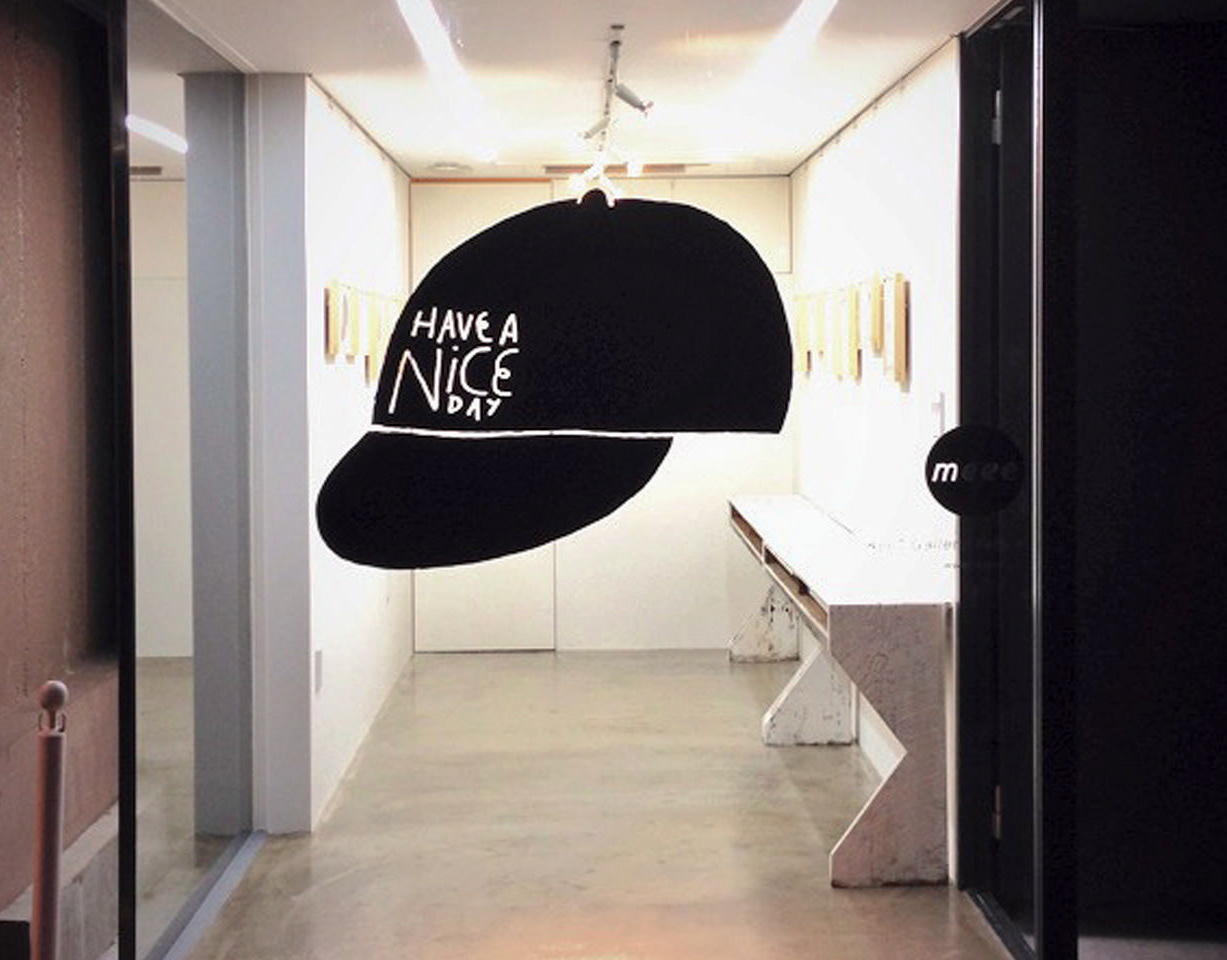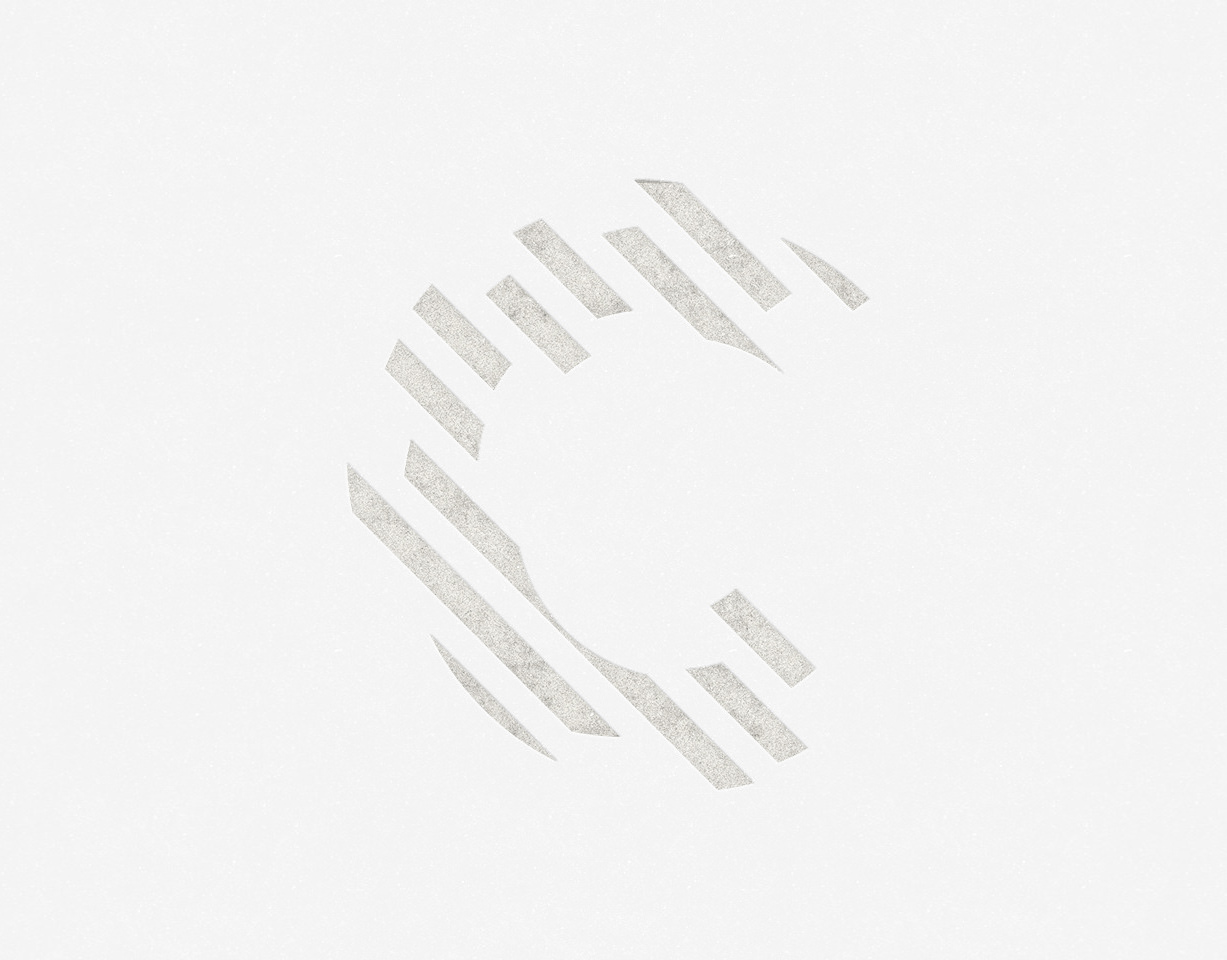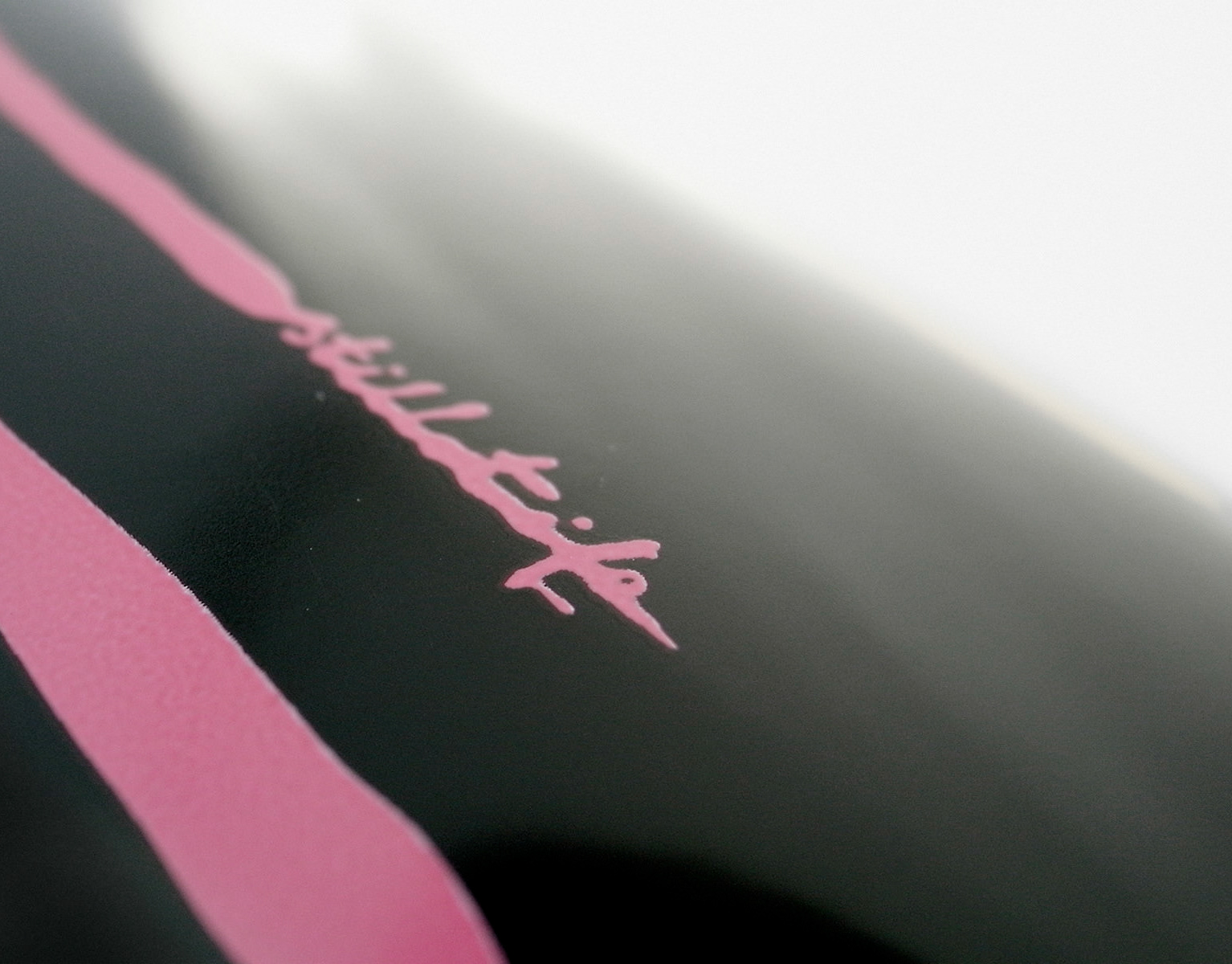
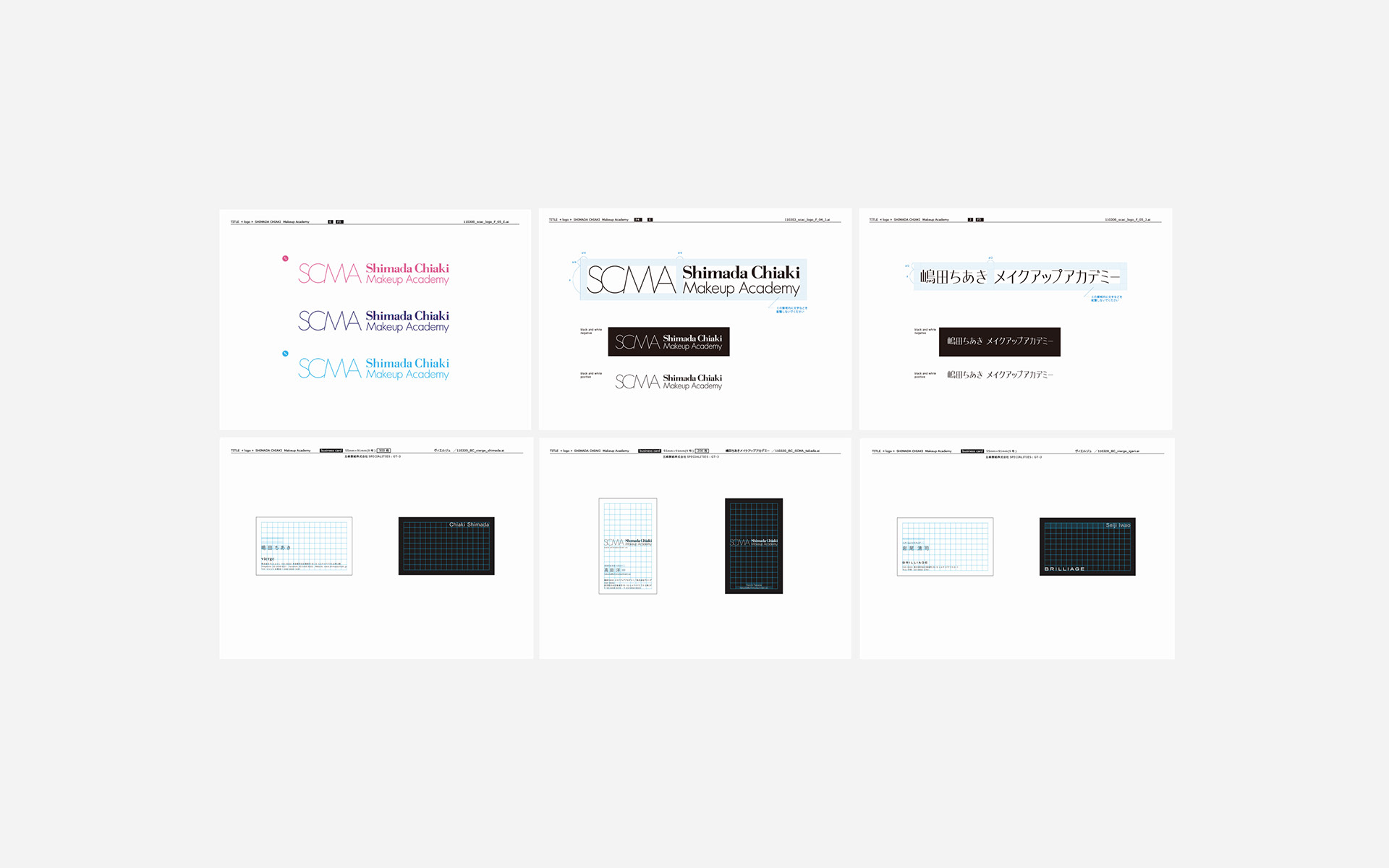
ロゴ・名刺デザイン/名刺:4号(91×55mm)・スペシャリティーズ180kg・オフセット印刷1C/My Role:Logo Design, Graphic Design

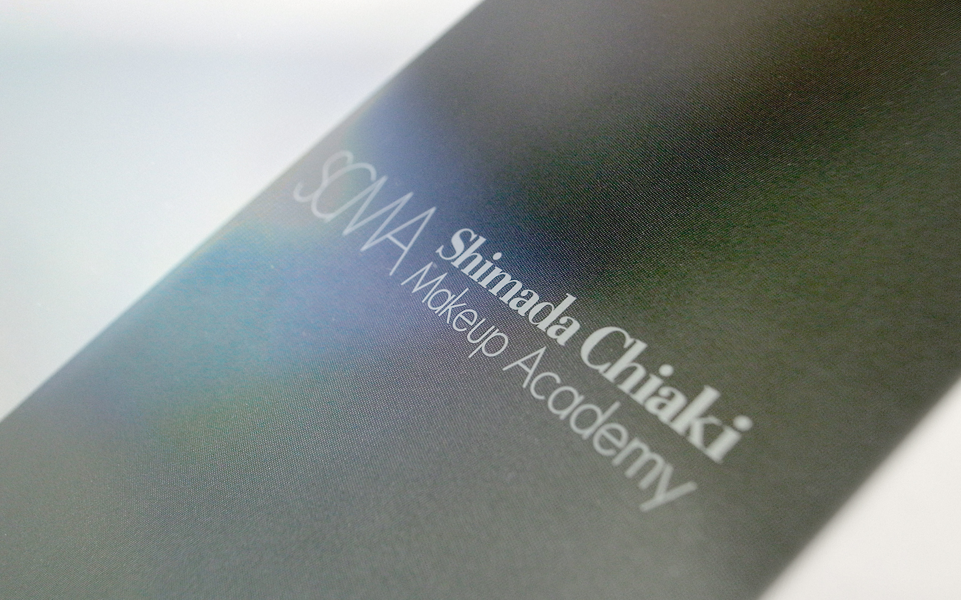
ヘア&メイクアップアーティスト・嶋田ちあき氏が主宰する「嶋田ちあきメイクアップアカデミー」のロゴと名刺を制作しました。 「メイクは表情を美しく見せるだけでなく、その人に自信と一歩踏み出す勇気を与えるもの」という嶋田氏の哲学に基づき、ロゴは既存書体をベースに細部を調整。関連ブランドとの調和を図りつつ、アカデミーとしての品格を微細な差別化で表現しました。 名刺には、化粧箱に用いられる光沢感のある用紙を採用。その上に細やかな網掛け(スクリーン・ティント)を施し、インクの重なりと紙の光沢が角度によって複雑に干渉し合うことで、視覚的にグレーの濃淡が変化する遊び心のある仕様を提案しました。メイクによって瞳や血色が輝き出す瞬間の高揚感を、手元のカードの視覚体験へと重ね合わせています。 - I designed the logo and business cards for the Shimada Chiaki Makeup Academy, led by the renowned hair and makeup artist Chiaki Shimada. Guided by Shimada’s philosophy that makeup not only enhances beauty but also empowers individuals with confidence and the courage to move forward, I refined the logo from a base typeface to achieve a precise balance between brand harmony and subtle distinction. For the business cards, I selected a high-gloss paper typically used for cosmetic packaging. By applying a fine screen-tinted texture, I allowed the interplay of ink overlay and paper gloss to create visual interference. This playful specification causes the gray tones to shift depending on the angle of the light, subtly echoing the transformative power of makeup—the exact moment a face lights up with newfound energy and passion.