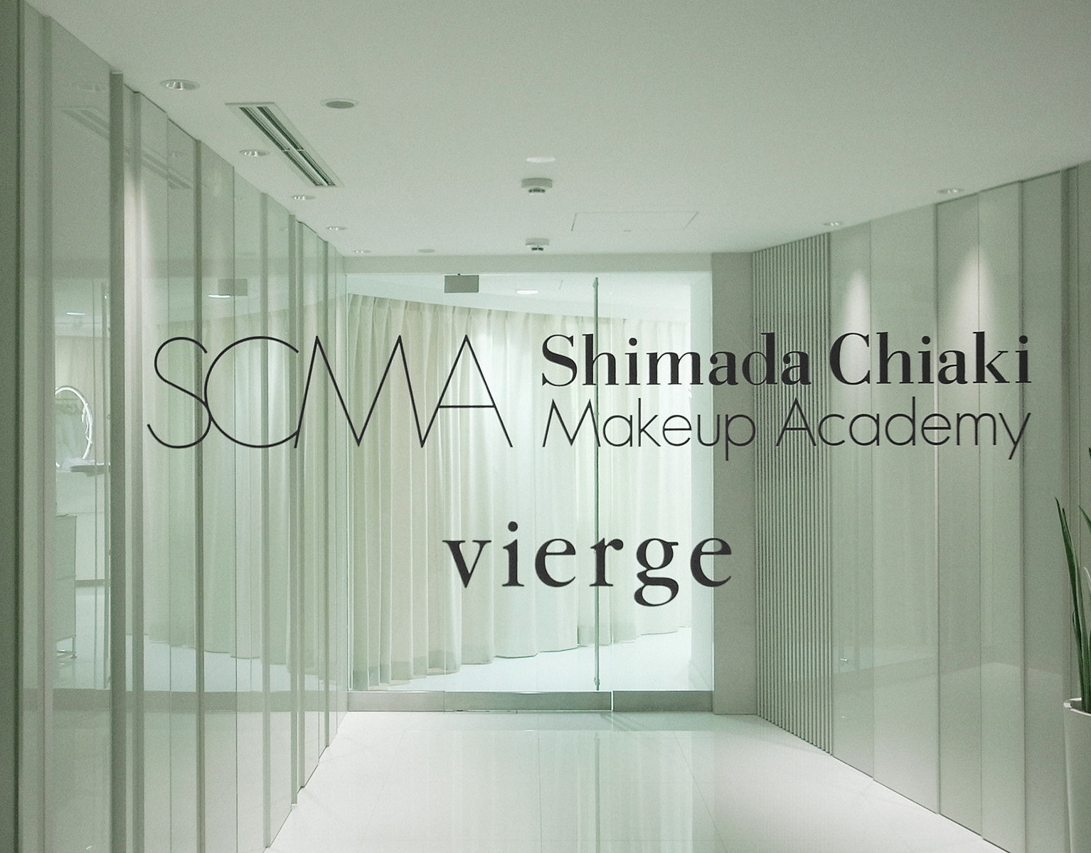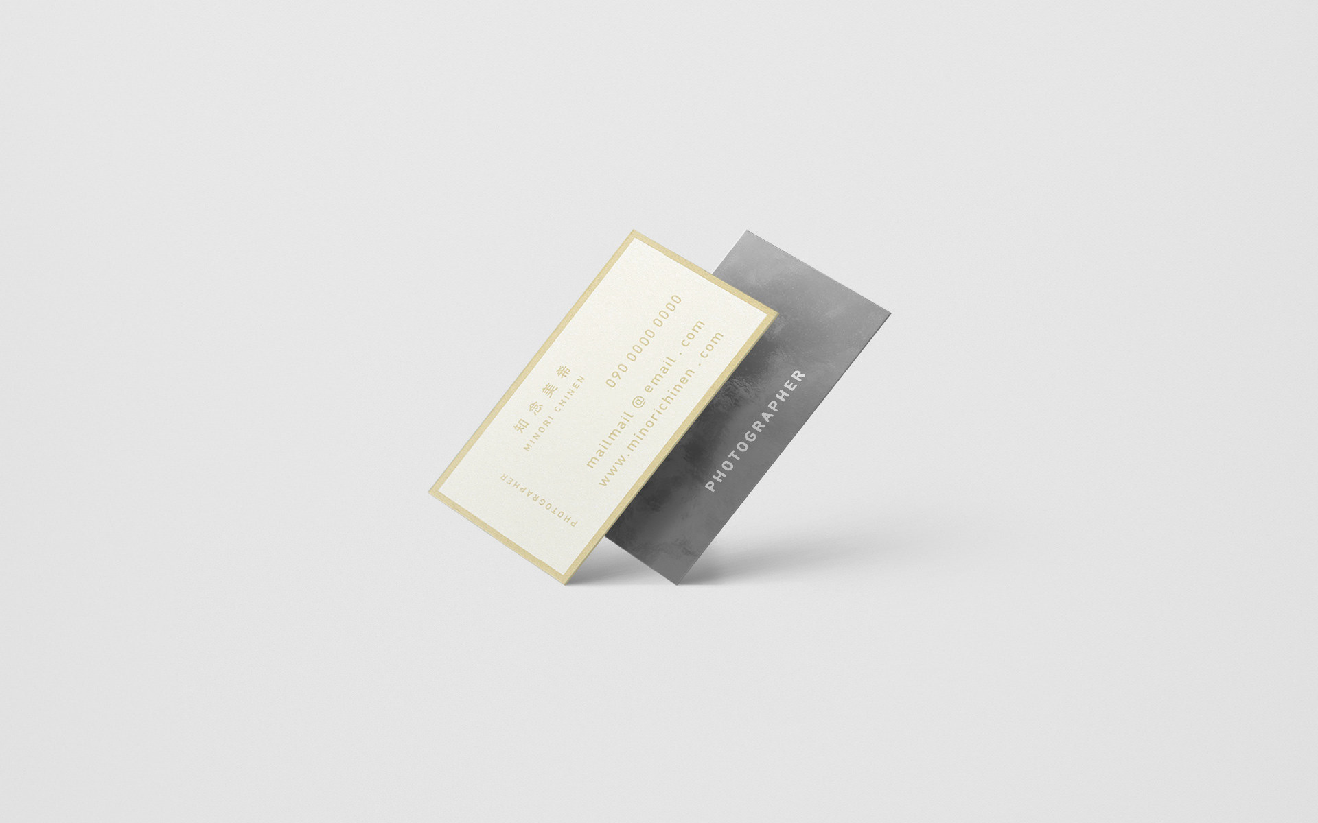
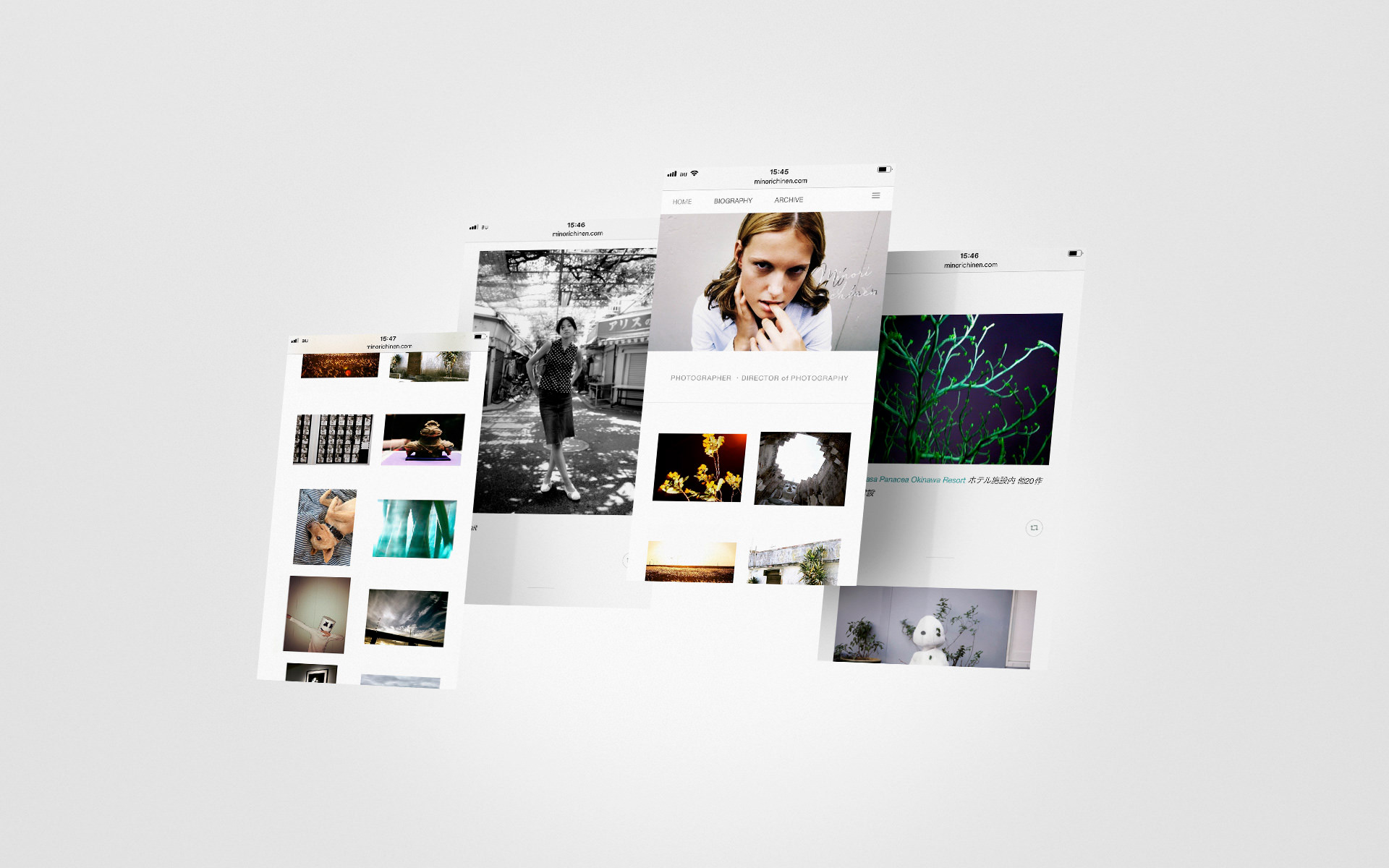
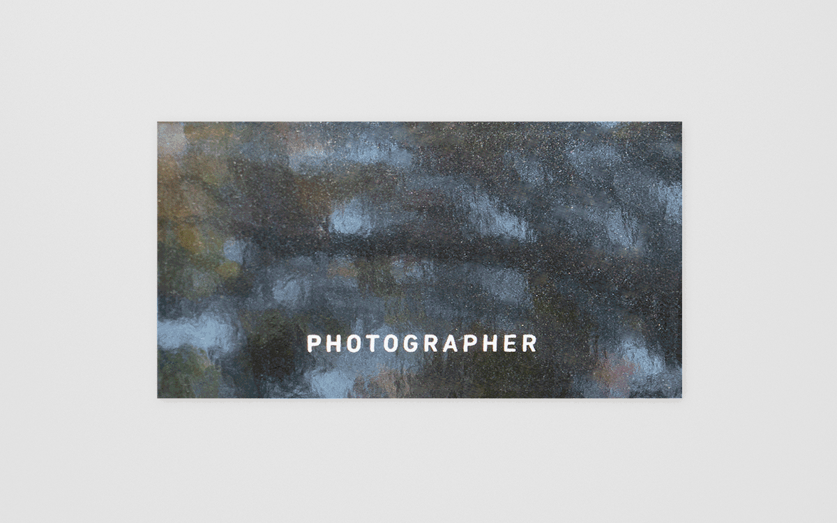
名刺:4号変形(41×91mm)・メタルクラフト合紙・特色1c/My Role:Direction, Graphic & Web Design

フォトグラファーの方から3度目となる依頼を受け、名刺のデザイン・制作を手掛けました。 今回は、クラフト紙と鏡面反射する特殊紙を貼り合わせた「専用の合紙」をオリジナルで作成。光の反射と屈折によって、見る角度ごとに画像の見え方が劇的に変化する視覚体験を提案しました。文字面には、茶色のクラフト紙に白インクを薄く載せることで、紙本来の地色を活かした素朴な表情に。メタリックな鏡面層と、ざらりとした紙肌という、対照的な質感を一枚のカードの中に共存させています。 制作にあたっては台湾の印刷会社と協働しました。日本国内では難しいとされる特殊な印刷仕様にも積極的に挑戦してくれる現地の技術力と、日本とは異なる独特な紙質を活かすことができました。 - For my third project with this photographer, I handled the design and production of their business cards. I developed an original duplex paper by bonding kraft paper with a mirror-finish specialty stock. This creates a unique visual experience where the image shifts dramatically through light reflection and refraction depending on the viewing angle. On the text side, I applied a thin layer of white ink to the brown kraft paper, maintaining its rustic, earthy character. This results in a striking coexistence of opposites: a metallic, mirrored surface and a raw, tactile texture within a single card. To achieve this, I collaborated with a printing house in Taiwan. Their technical expertise allowed us to push beyond the limits of conventional domestic printing, successfully incorporating distinctive paper qualities and challenging specifications unique to the region.