My Role:Logo Design

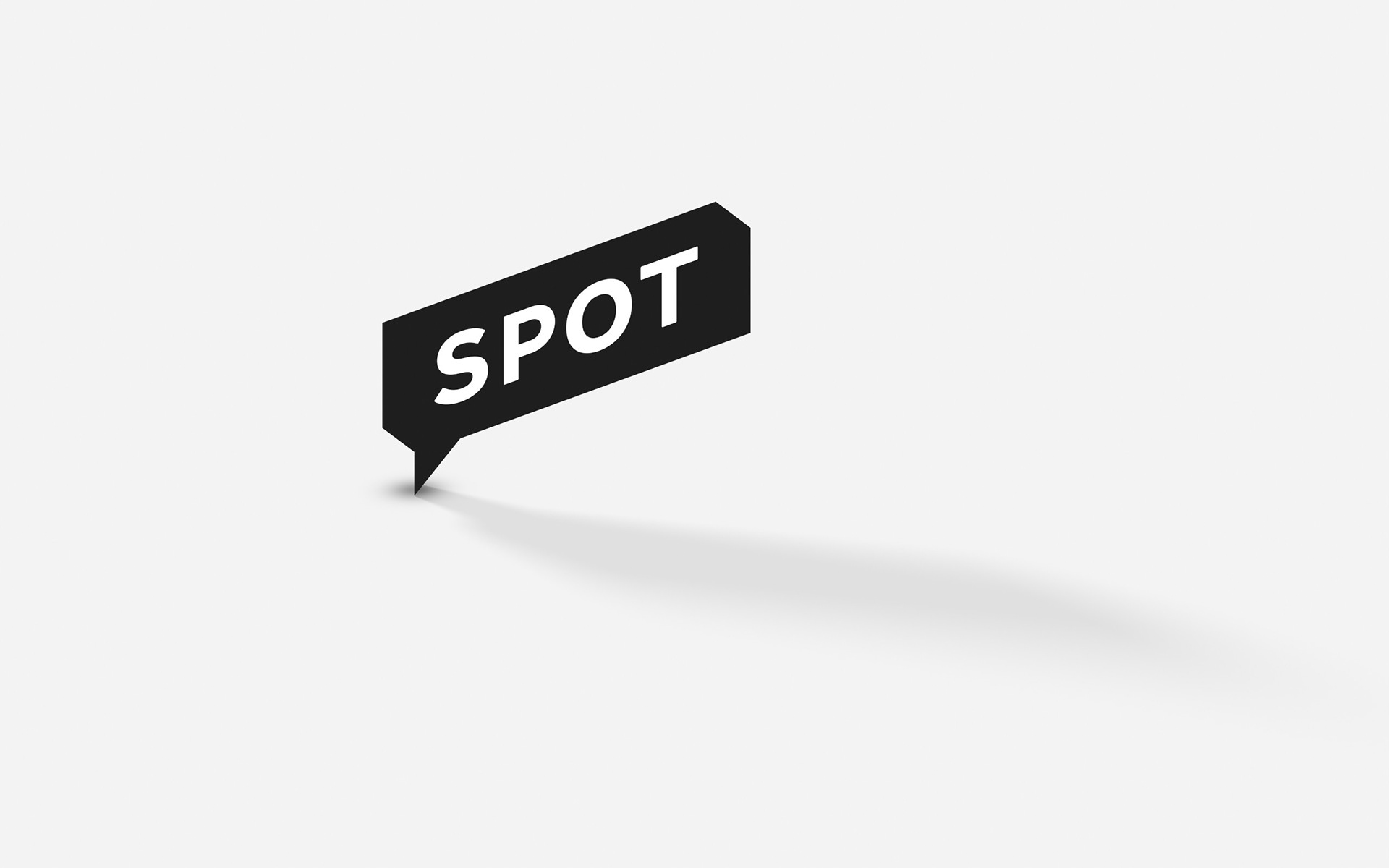
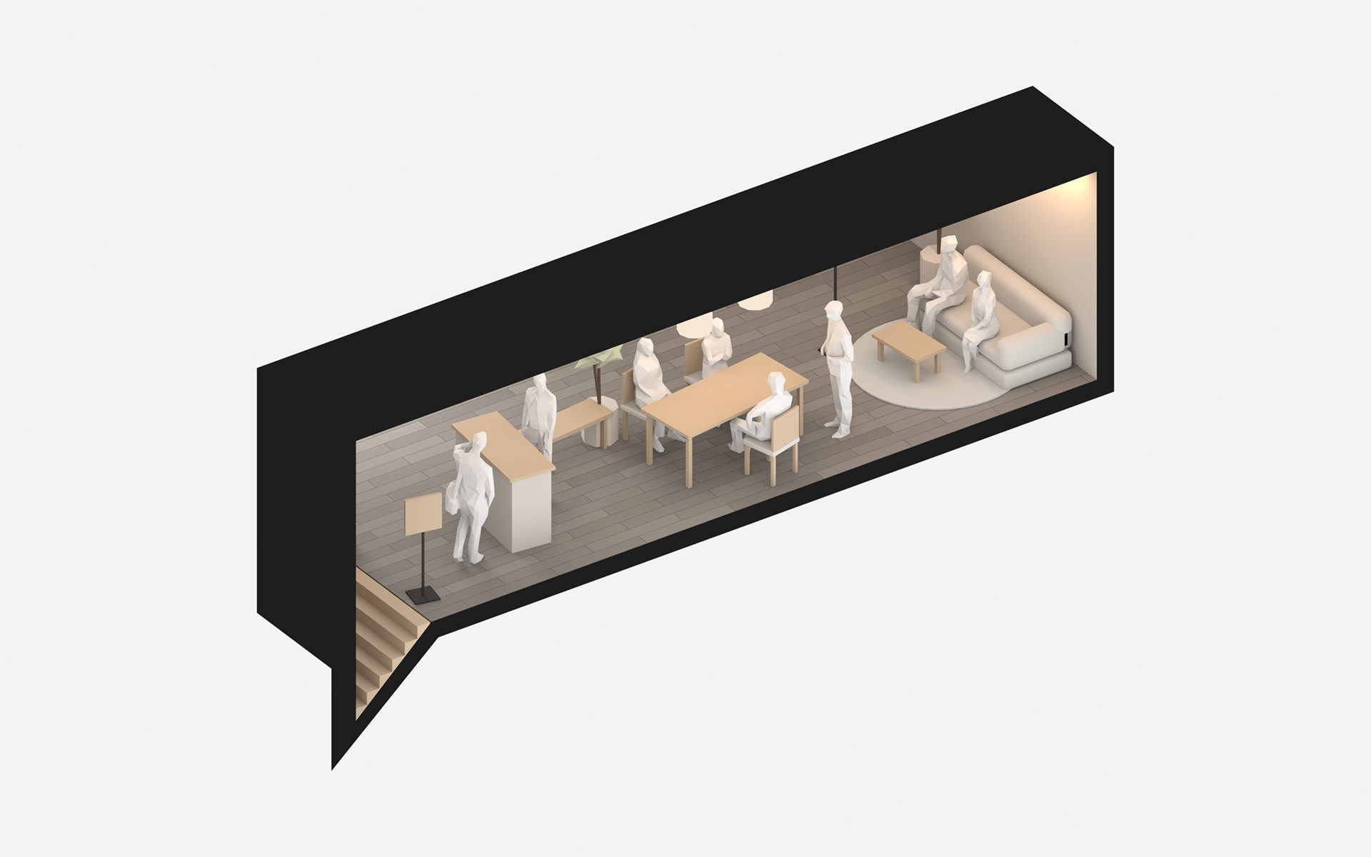
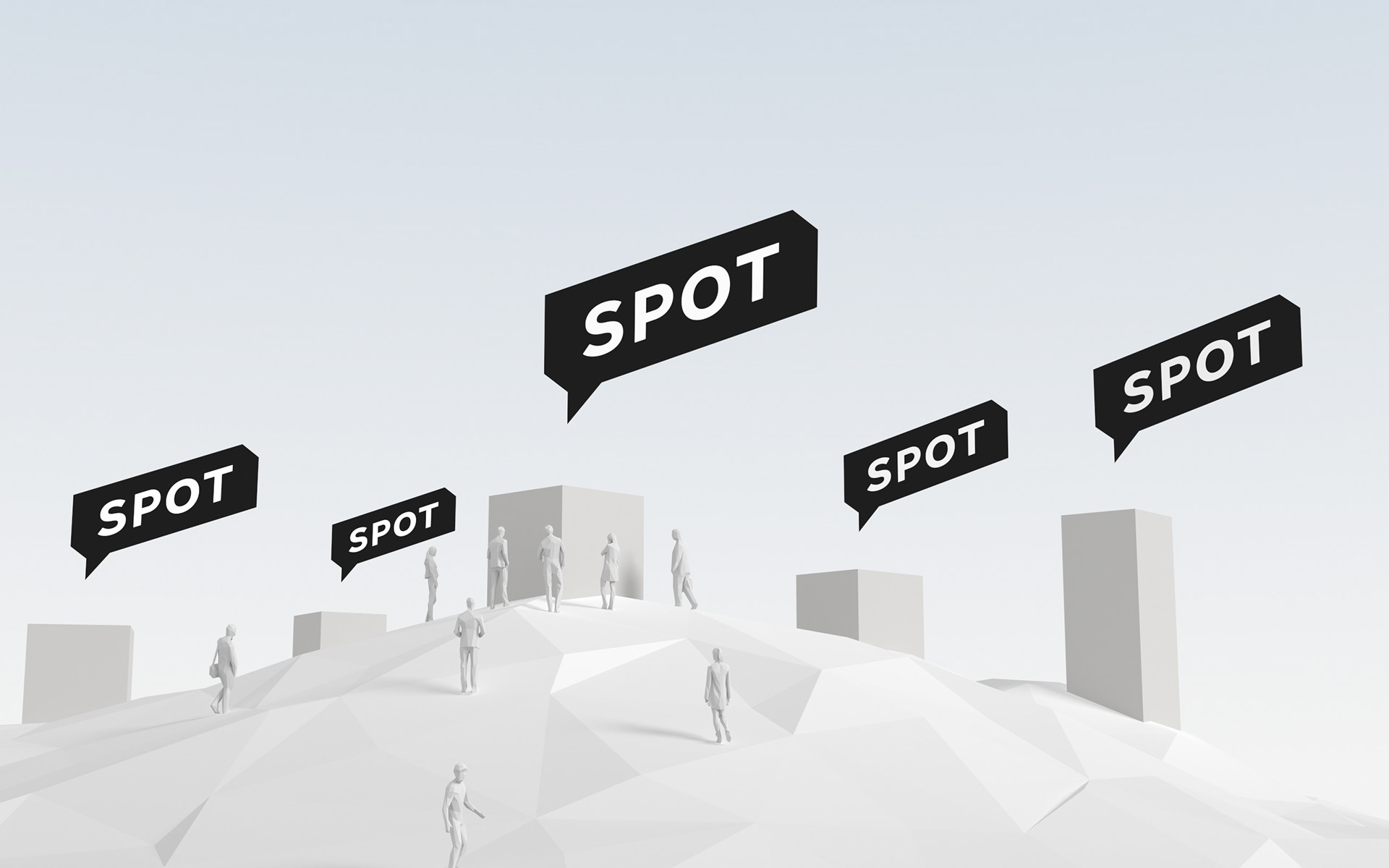
チームで利用できるワークスペース「SPOT」。サービスの立ち上げにあたり、ロゴをデザインしました。 地図の上で場所を示す目印は、人が集い会話が生まれる吹き出しでもあり、奥行きをもったひとつの空間でもあります。使いやすい場所を選べるオフィスと同じように、ロゴも横長の「SPOT」と一文字の「S」の二つを用意し、表示する大きさや画面の環境に合わせて選べるようにしました。 - SPOT is a workspace for teams, available by the day. For the launch of the service, I designed the logo. The sign that marks a place on a map is also a speech bubble where people gather and conversations begin, and a space with depth. Just as teams can choose the office that suits them, the logo comes in two versions, the full "SPOT" and the single letter "S," so the right one can be chosen for each size and screen.