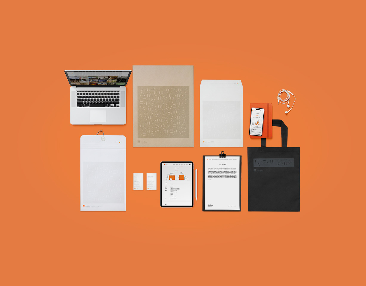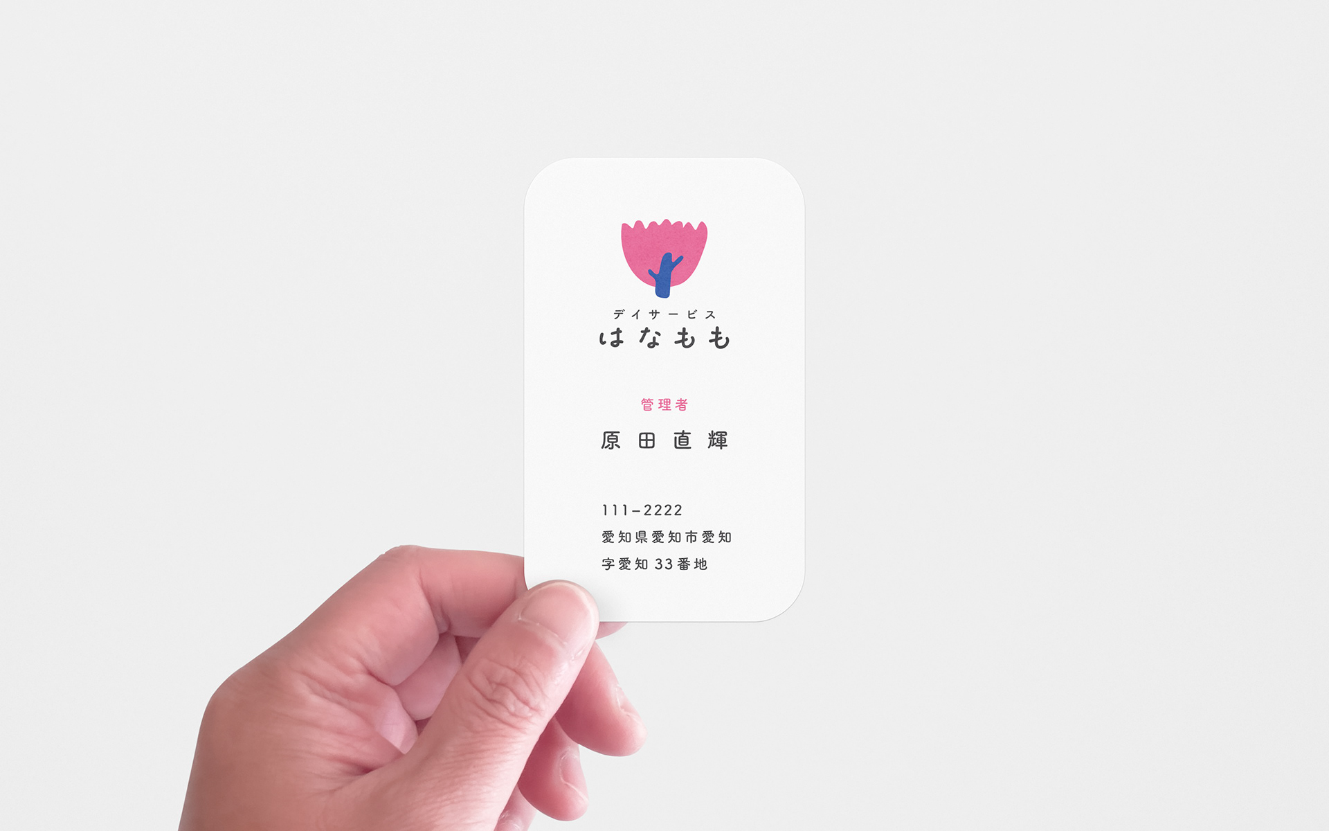
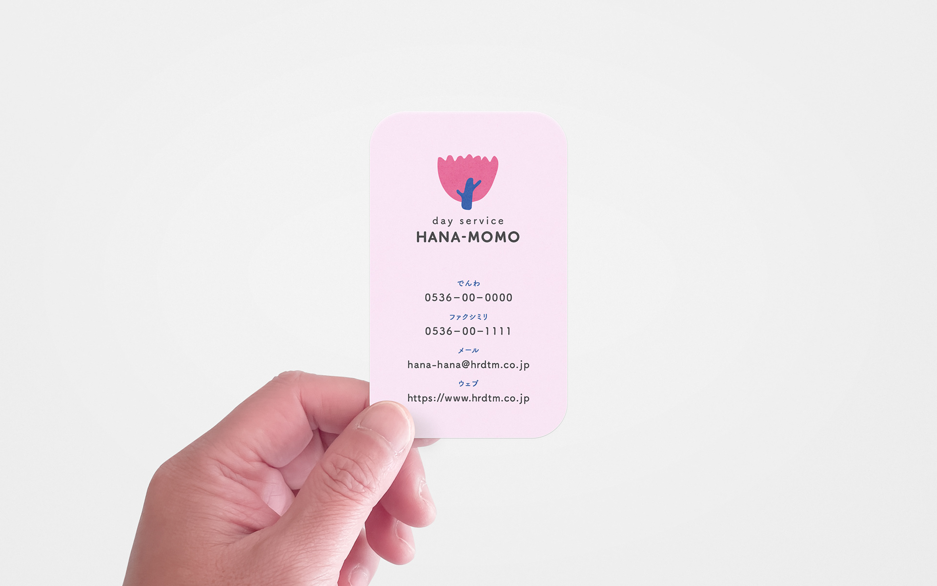
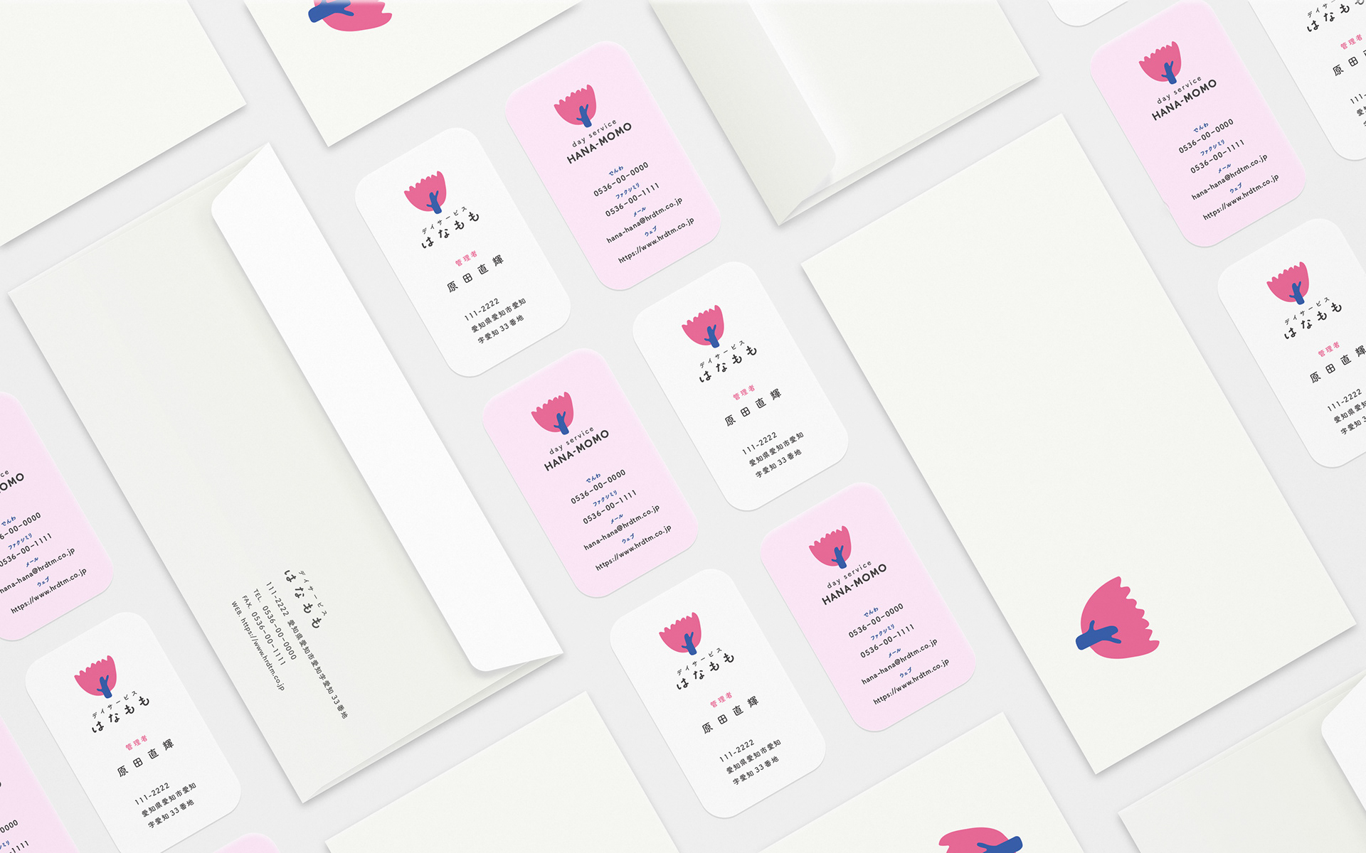
名刺:上質160kg / 角丸10mm加工 / オフセット印刷4c / 長3カマス封筒:プレインホワイト 100g / オフセット印刷4c+1c / My Role:Direction, Graphic Design

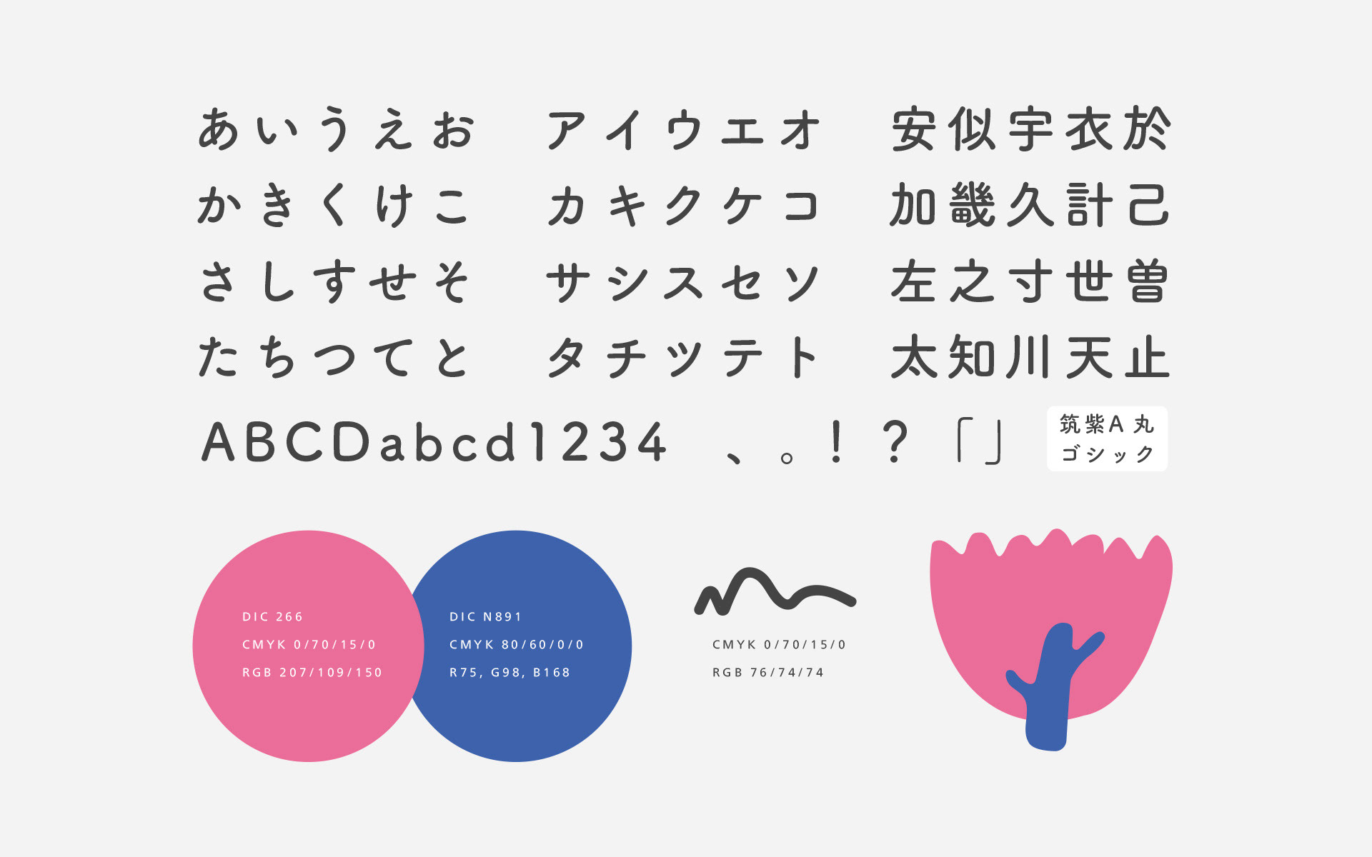
「デイサービスはなもも」の事業継承にあたり、ロゴのデザインと、視覚的な佇まいを整えました。 施設の敷地に咲く「はなもも」をシンボルに、日々のケアを支えながら、利用される方の「感性を回復させる場所」でありたいという願いをマークに込めています。その人らしさが自然と引き出される、くつろぎの空間。書体の選定から名刺・封筒の展開にいたるまで、利用者やご家族、そして現場を支えるスタッフの方々の想いに寄り添う、穏やかな調和を設計しました。 - For the business succession of "Day Service Hanamomo," I was responsible for the logo design and refining the visual presence of the facility. The symbol, inspired by the "Hanamomo" blossoms on the grounds, embodies the wish for a "place for sensory recovery" alongside daily care. The design aims to support an atmosphere where one’s true self can flourish in comfort. From the selection of typography to the development of business cards and envelopes, I designed a gentle visual harmony that resonates with the residents, their families, and the dedicated staff.