My Role:Symbol Design

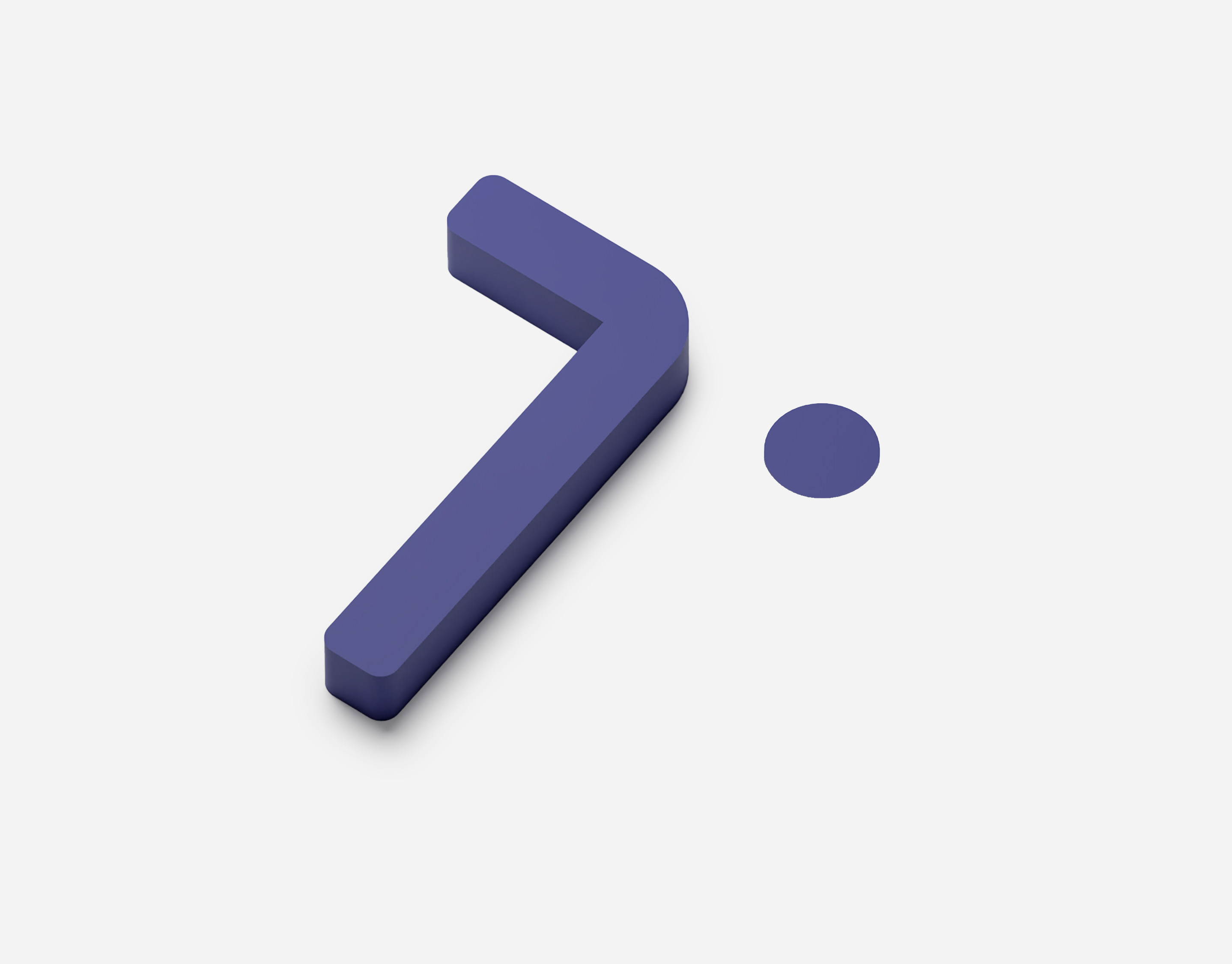
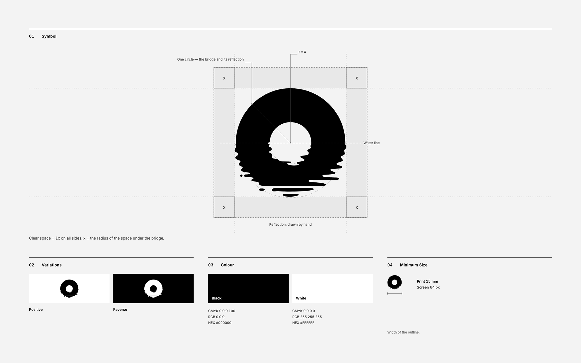
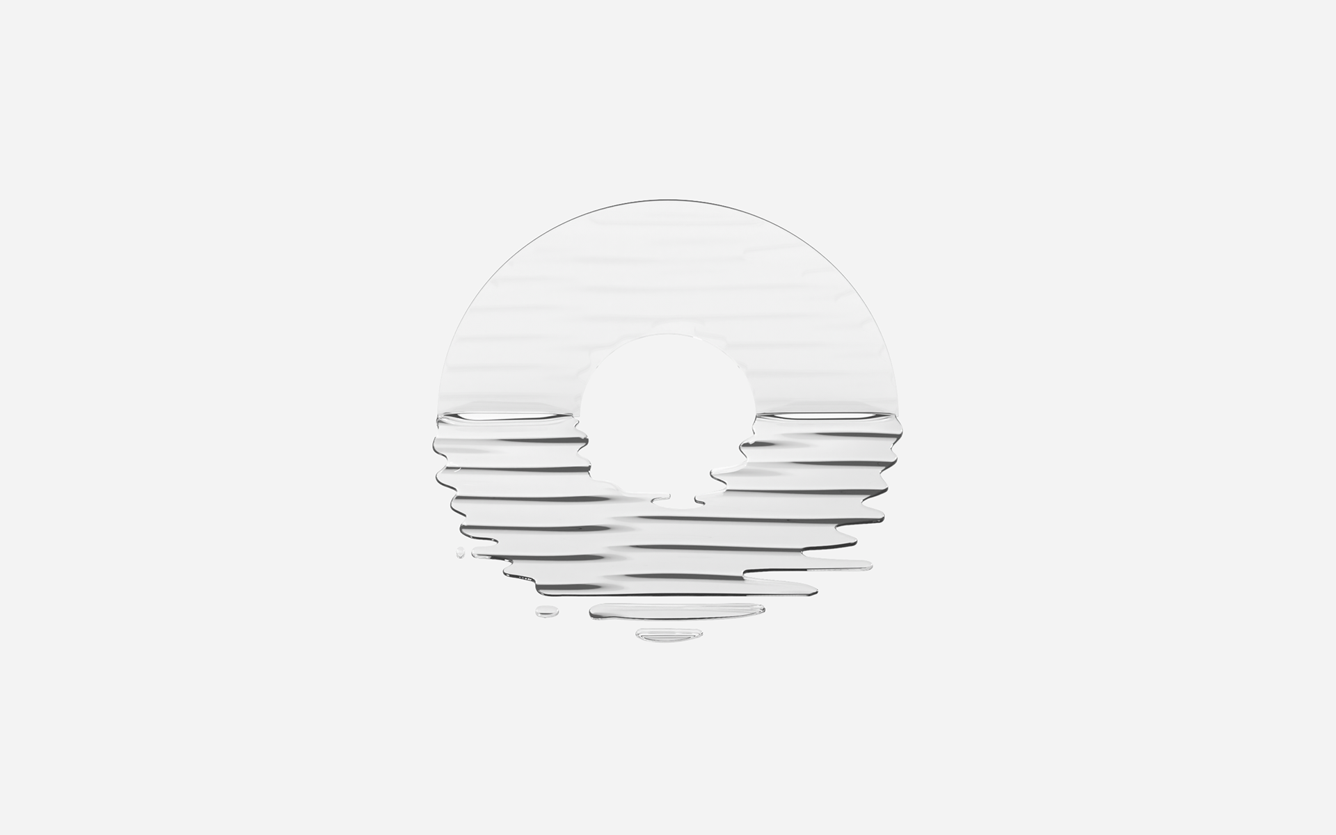
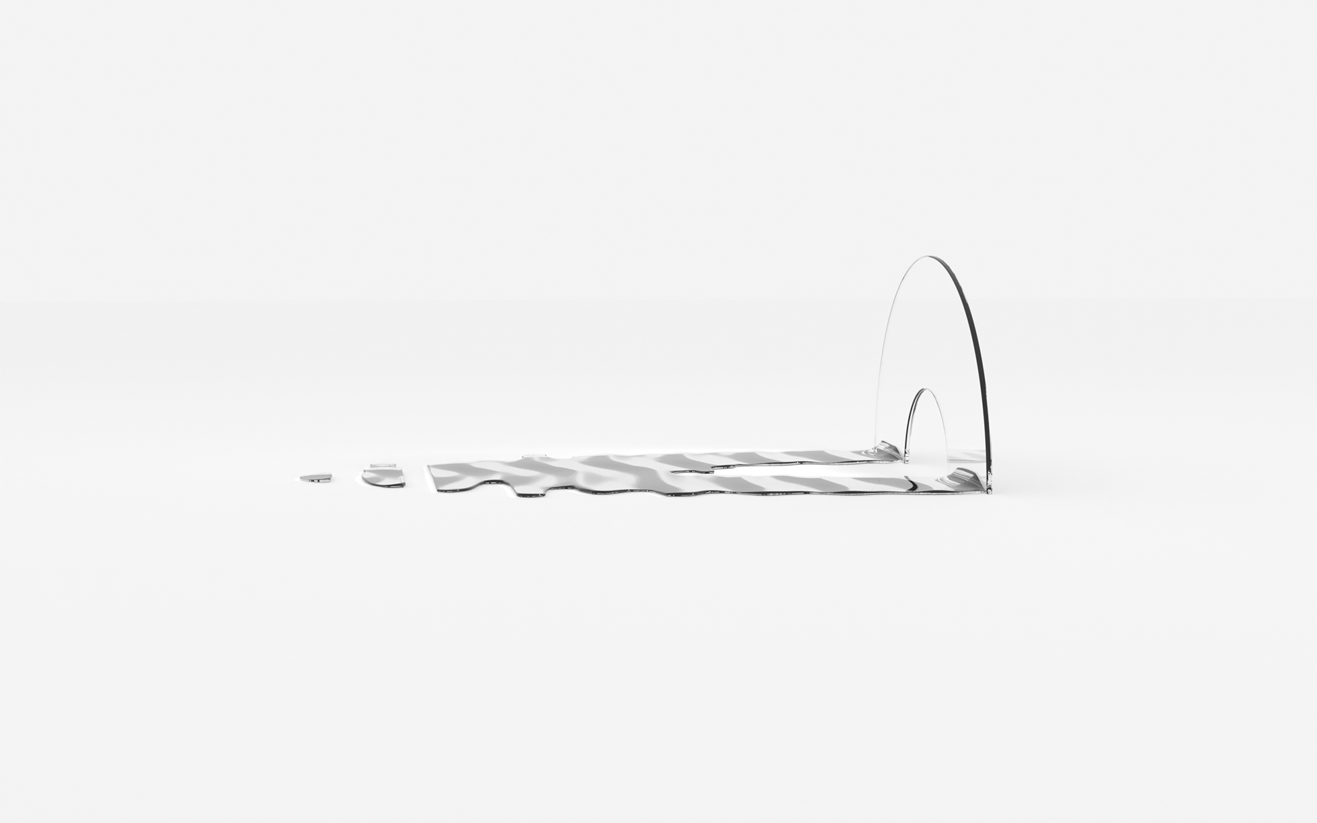
「街の魅力発信委員会」の立ち上げにあたり、シンボルをデザインしました。 豊かさを意味する「豊」と、人やものの行き来をつなぐ「橋」。豊橋という地名の二つの字から、架かる橋と、その姿を映す水面を描きました。橋の下で静かに揺れる波は、まちの魅力が外へと広がっていく様子でもあります。まちに暮らす人と、まちを訪れる人。そのあいだに、穏やかな往来を架けるしるしです。 - For the launch of the City Charm Committee, I designed the symbol. "豊" for abundance, and "橋," the bridge that lets people and things come and go. From the two characters of the city's name, Toyohashi, I drew a bridge and its reflection on the water. The gentle ripples beneath the bridge are also the city's charm spreading outward. A quiet mark that bridges the people who live in the city and those who come to visit.